top of page

An Informational Site Dedicated to
Canadian Beef Producers
charlesgracey.net

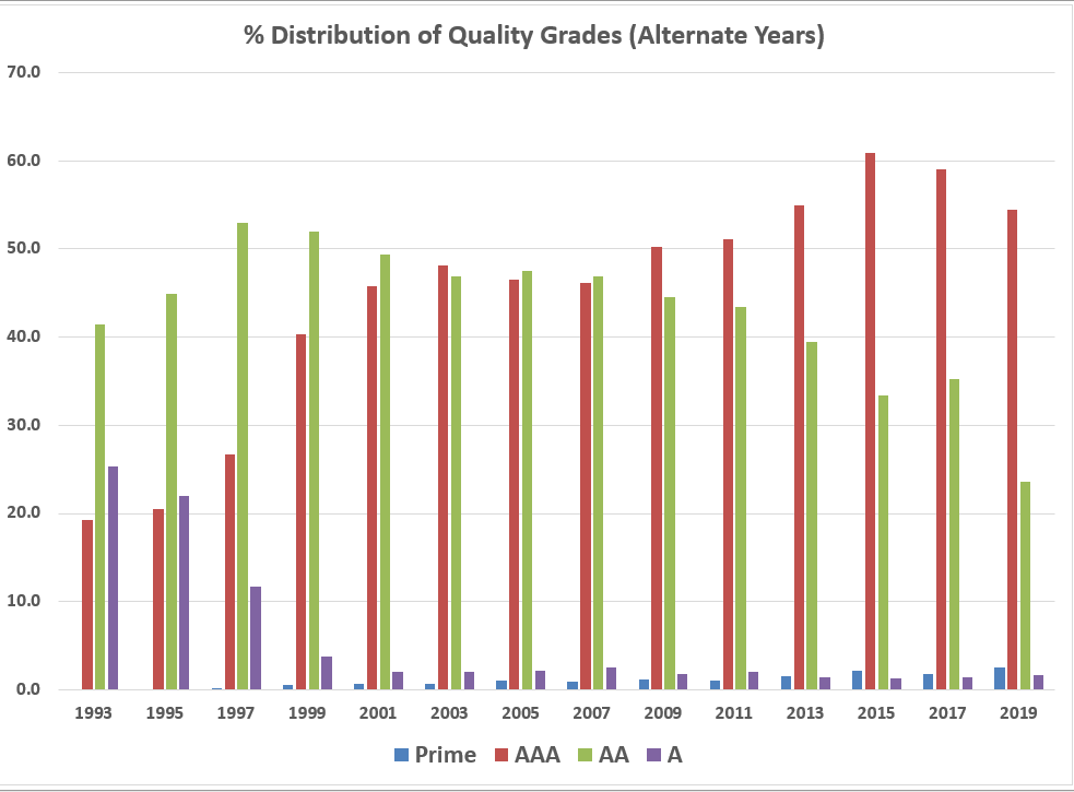
This table and the accompanying charts show the quality grade and yield class distribution from 1993, when the present grading system was launched, to the present time. The accompanying two charts show the trend in quality grades and yield classes over that period. The two charts reveal that quality and yield appear to move in opposite directions. Other articles posted on this site argue that it is possible to maintain high quality and improve yield but this requires that producers have access to grading results as the basis for improvement.


bottom of page